Statistics and Business Analytics
Revenue, lesson counts, cancellations and trends, calculated from your own records.
Statistics and Business Analytics in the app, step by step
Filmed in the live app, at your own pace. Use the player controls to pause, replay or go full screen.
Good to know
- Statistics are only as good as the records behind them. Mark lessons complete and log cancellations as they happen.
- Cancellation statistics show how much time and revenue late cancellations are costing you.
Stats turns the lessons, payments and cancellations you have already recorded into a picture of how your business is really performing.
-
Open Stats
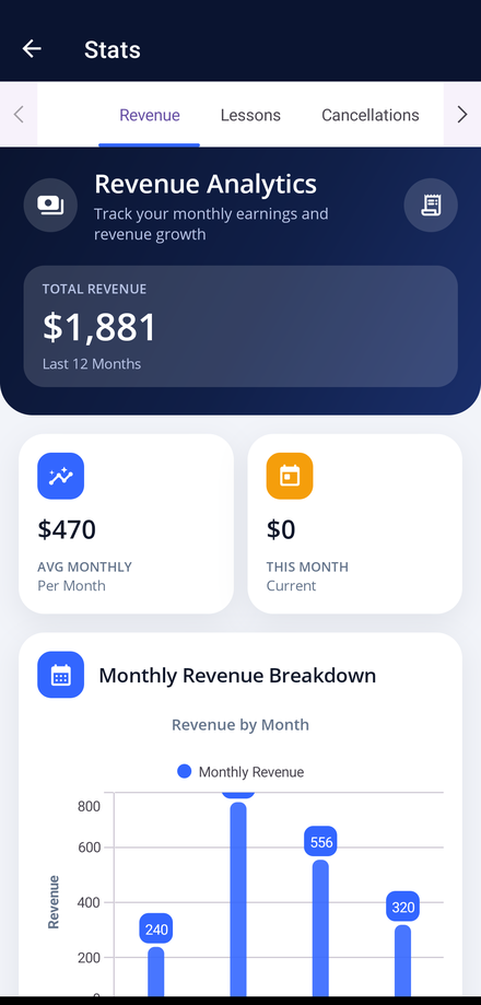
Tap the Stats tile on your dashboard. Revenue Analytics opens first.
-
Read your totals
The navy card shows your total revenue and average monthly earnings, with the current month shown alongside for comparison.
-
Follow the monthly breakdown
The chart underneath shows revenue for each month of the period, so you can see which months are strongest.
-
Cover every tab
Swipe the strip across the top to reach all ten reports: Revenue, Lessons, Cancellations, Overall, Performance, Efficiency, Engagement, Benchmarking, Predictive and Mock Tests. The first tab you open may briefly show a loading message while it calculates, and the narrower tabs reveal their figures as you scroll down.
-
Change the period
Step back through previous months and years to compare one trading period with another.
-
Export the numbers
Export a report as a PDF or email it straight from the app to keep your records complete.